


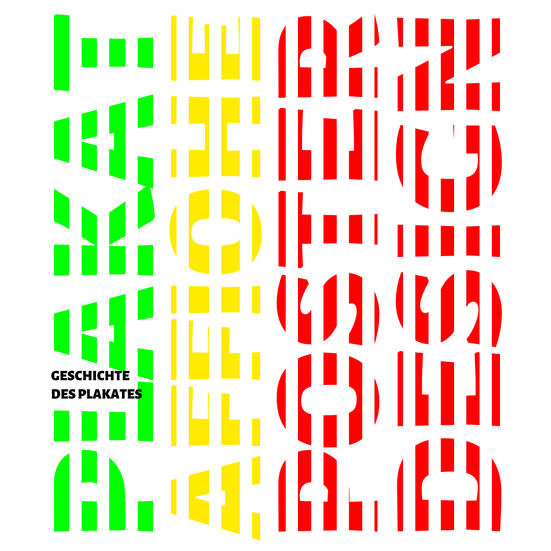
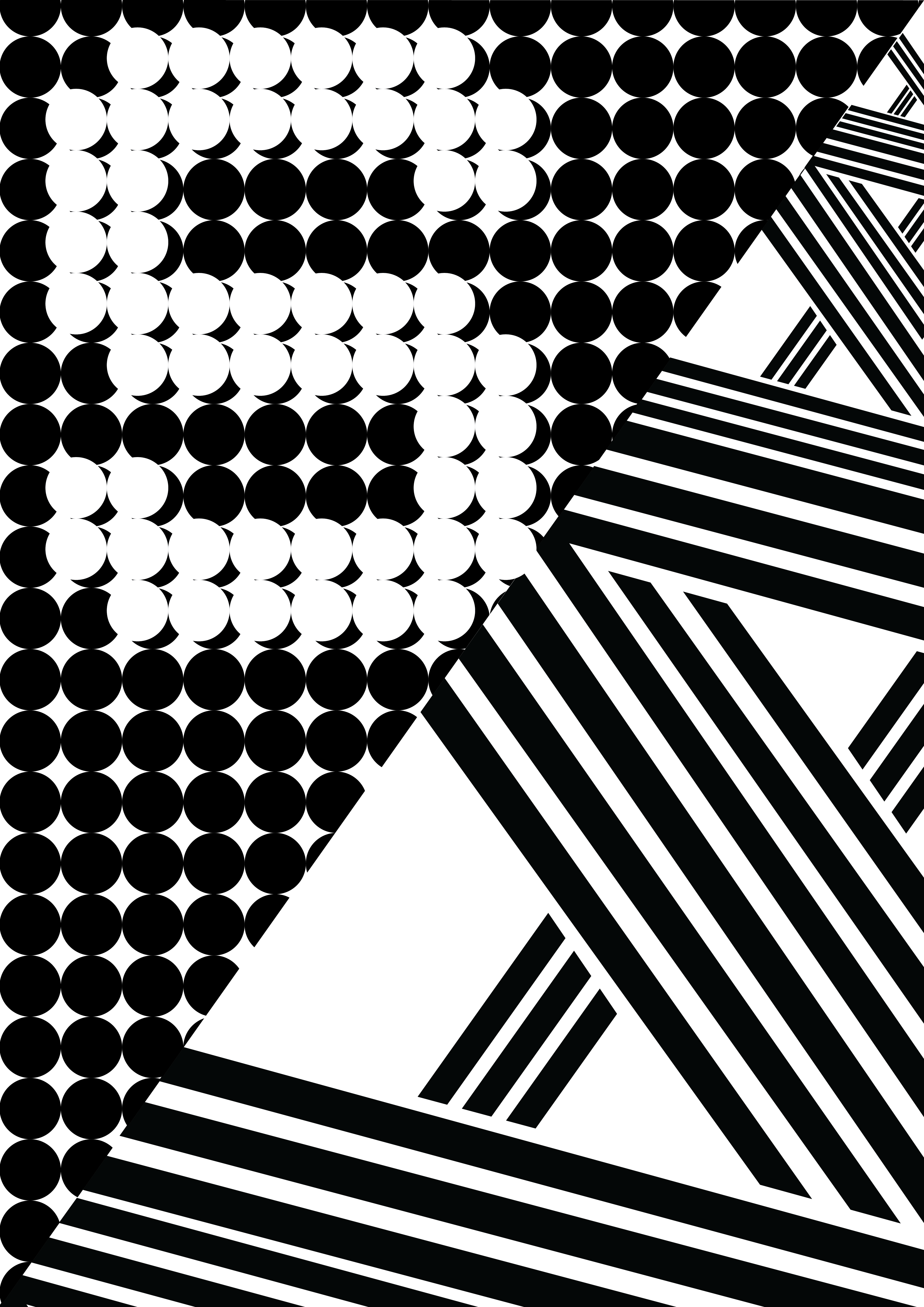
Recreated of Josef Mueller Brockmann, 1971.
History of the Poster, Swiss Design.


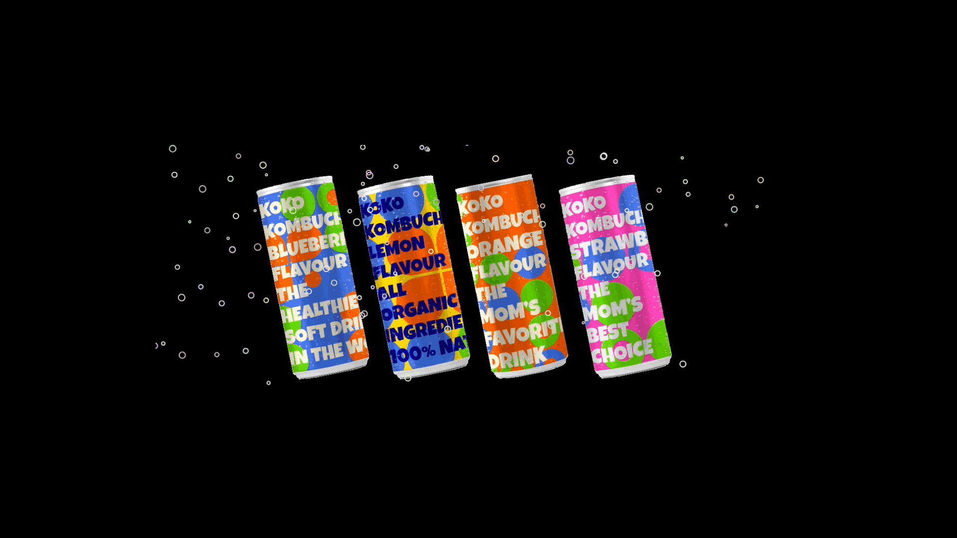
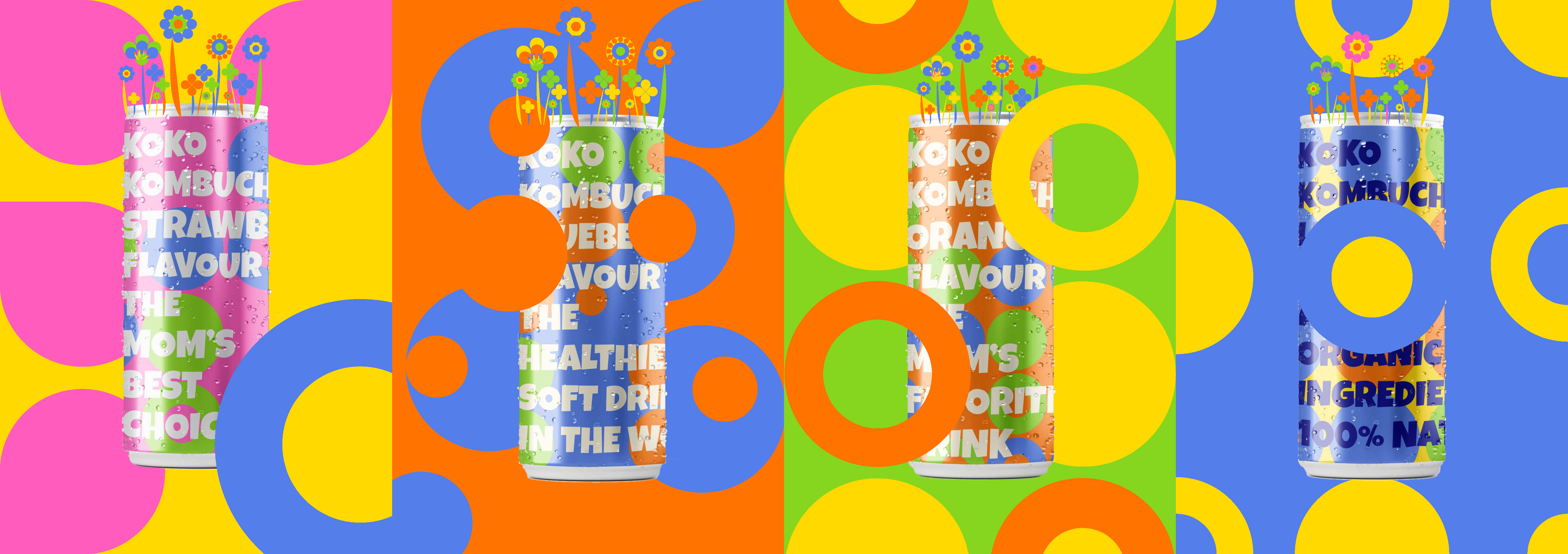
KOKO Kombucha Advertising (OOH)
Please Click the OOH(Out of home advertising) and enjoy the bubbles and sound. Plus, You can see the dancing Can.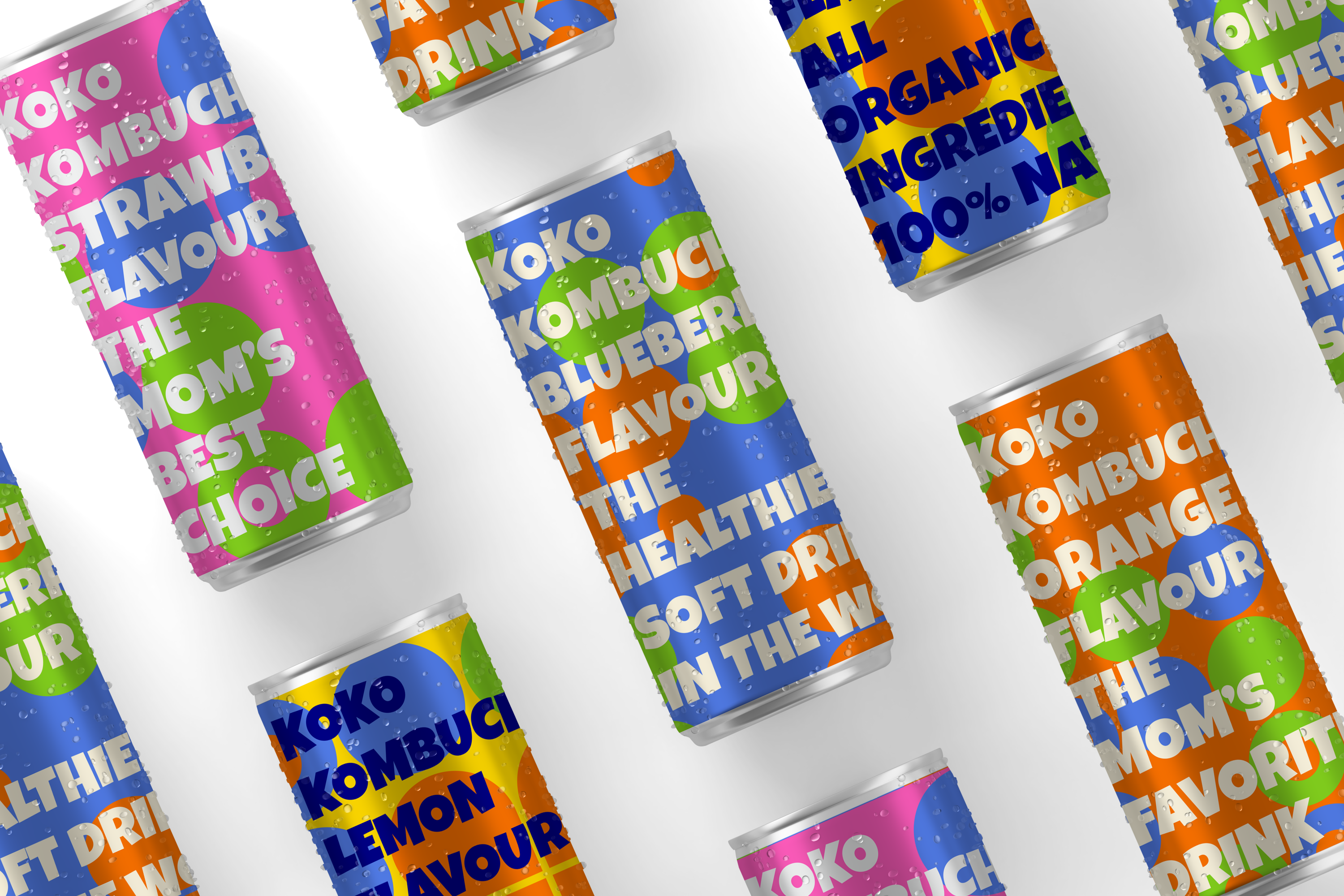
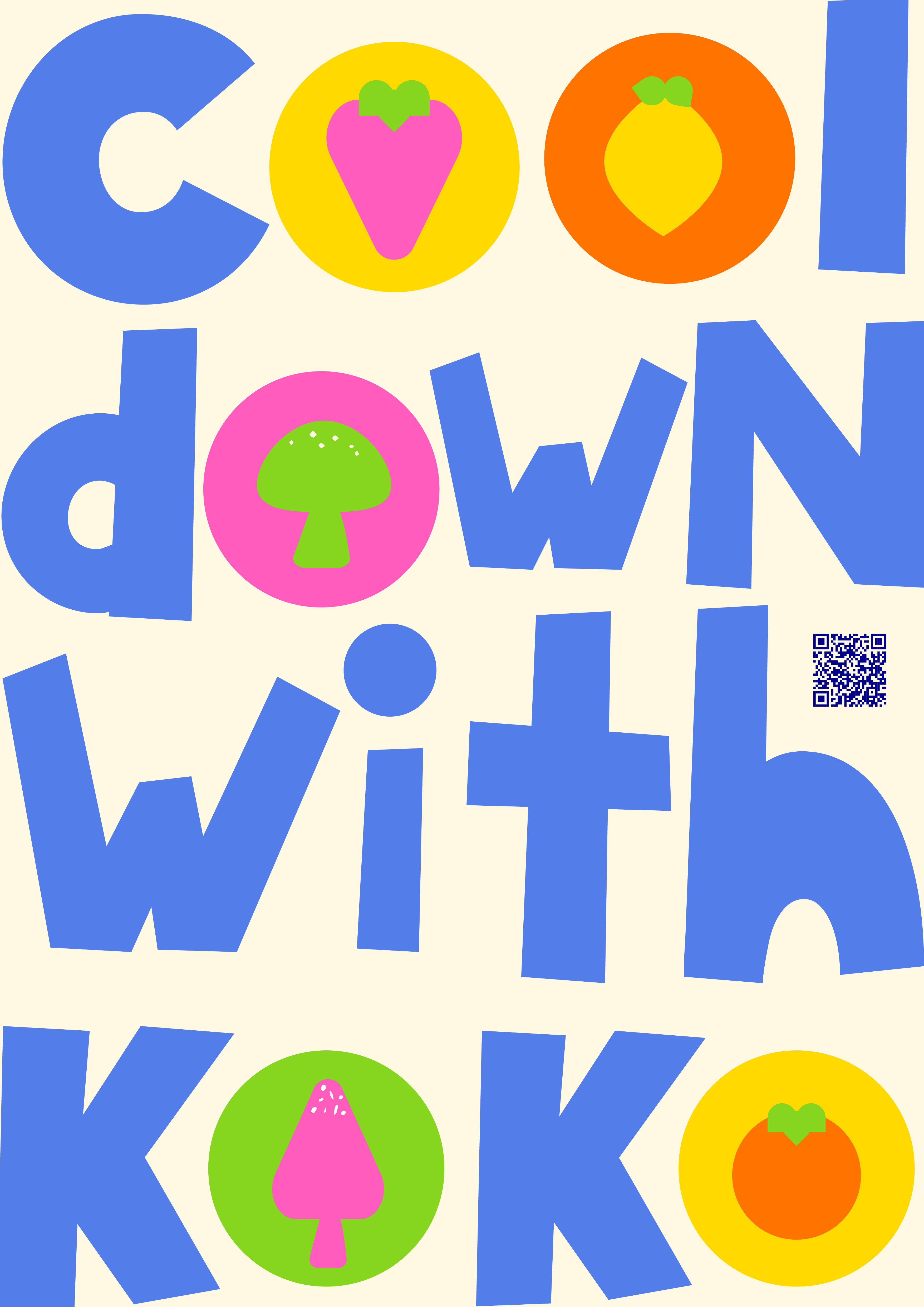
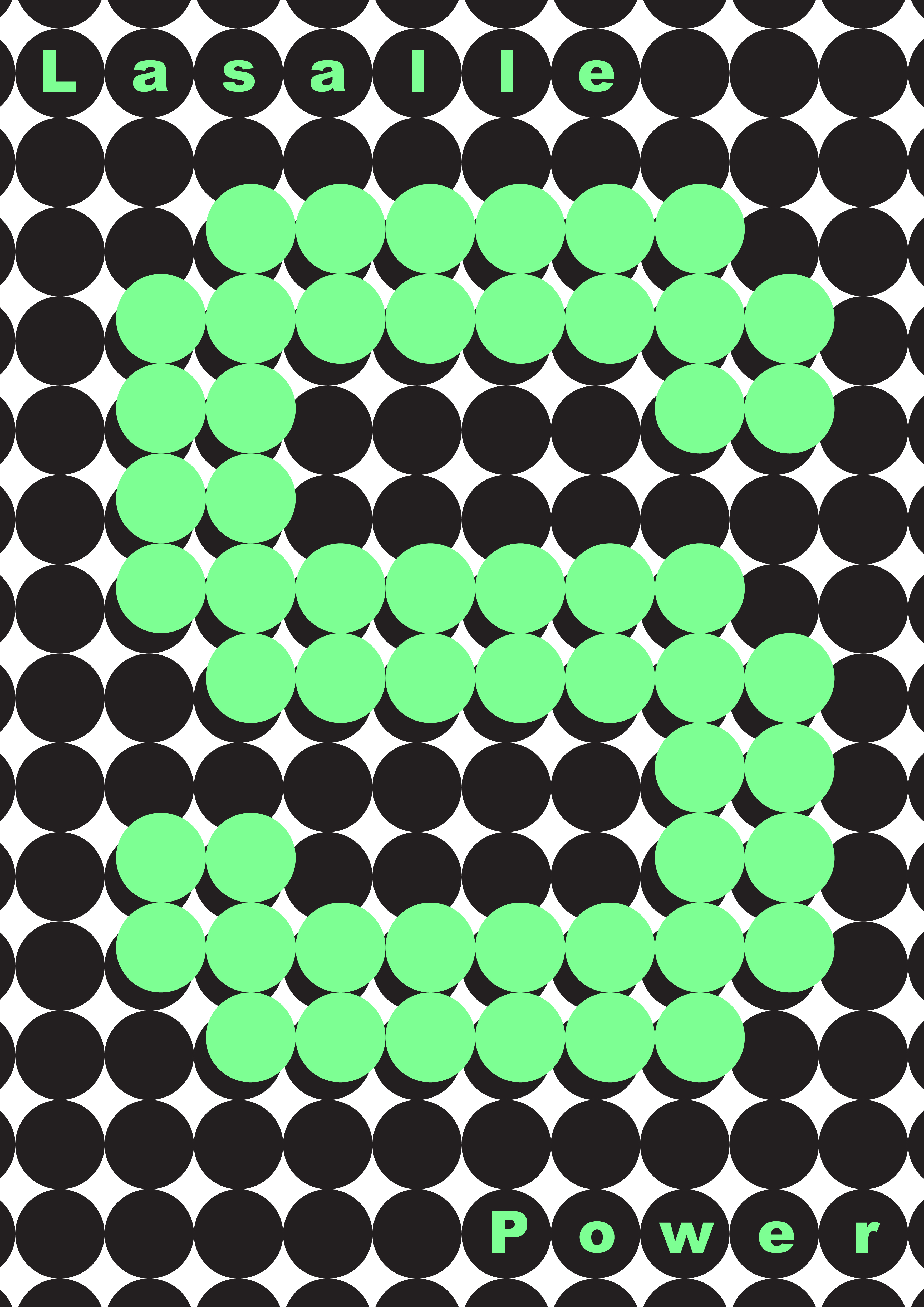
KOKO Kombucha
I decided to construct a billboard relating to the branding project "KOKO" that was carried out as my own project.
KOKO's origins are straightforward. KO was extracted from Kombucha and transformed into KOKO. Can you detect the sour and pungent flavor of Kombucha just by looking at the brand name? As the drink's light and simple name implies, it is designed to assist consumers in following a basic and nutritious diet. Young mothers were identified as potential customers. They are welcome to share the beverage with their infants and husbands. KOKO is made entirely of natural components and packaged in a can. Strawberry, orange, blueberry, and orange are the brand's four distinctive flavors. Because the brand identity is fresh, light, healthy, exciting, and dynamic, the design is centered on these characteristics.
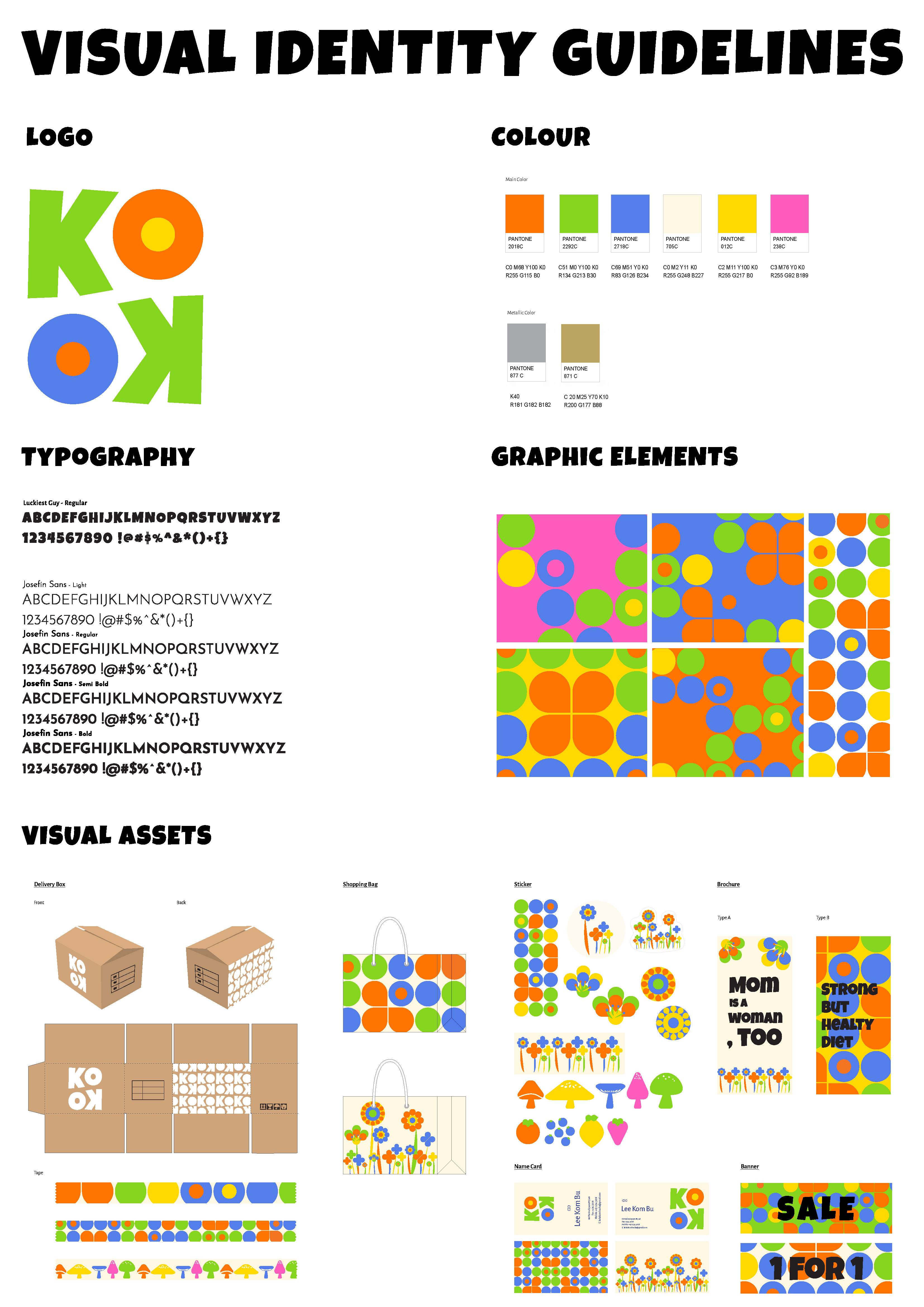
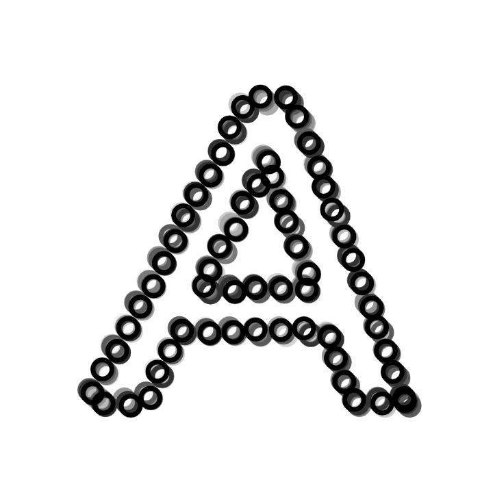
The Letter Design (Logo Design) is sinspired from "Paula Scher"
Paula Scher is one of the world's most renowned graphic designers. Scher's work, which has been dubbed the "master conjurer of the instantly recognizable," straddles the boundary between pop culture and fine art. Her images have become iconic, astute, and approachable in the American lexicon. I regarded her design to be quite basic and marked by a lack of excess. Rather of utilizing monochromatic colors, I attempted to represent her design, which establishes brand identification, by using a variety of hues into my design. The "KOKO" logo is comprised of four primary colors, with the option of using additional colors based on the drink's flavor. Additionally, Paula Scher's design is defined by the use of strong or nearly-basic typefaces. Her affinity for San-Serif over Serif was also uncovered via an examination of her design history through Pentagram.
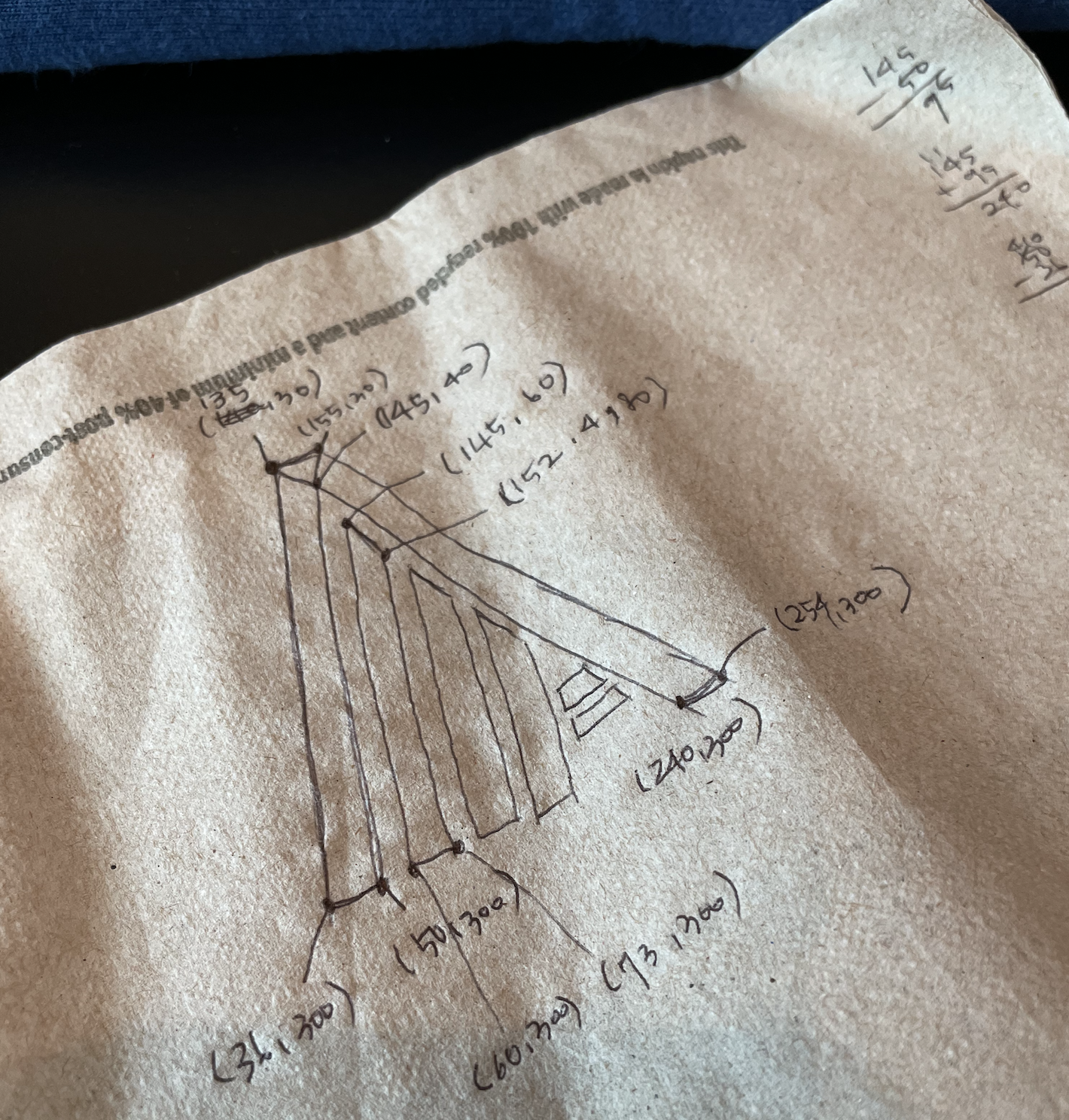
A list of sketches
- Random Colours Moving sketch that shows how to use perlin noise and loops.
- Moving Image - using buffer a sketch that demonstrates how to make type move.
-
fft. / buffer / loop sketch
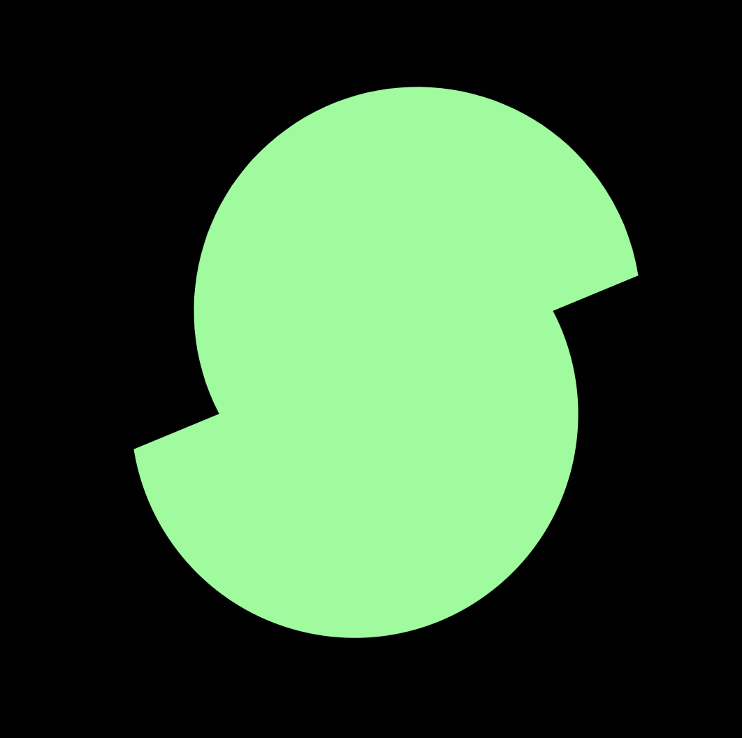
The design evokes the sensation of carbonation spilling from the beverage can's top.
The circle was created tiny to simulate the sensation of a carbonic acid bubble.